Mastering Client Dashboards for Local Businesses: A Comprehensive Guide for Marketing Agencies
As a marketing agency seeking to elevate the success of local businesses, utilizing the magic of data is non-negotiable. Data is not just a numerical record; it's a gold mine of insights that can revolutionize the operations of a local business. However, understanding data and extracting its value is a specialized skill. The next step in your marketing agency is to understand how to properly translate the raw, complex data into digestible, meaningful, and actionable insights. One crucial way of doing this is through an expertly crafted client dashboard. Let's dive into the principles and strategies that can transform your dashboards from being simple data interfaces to powerful business tools.
Understanding Your Clients Business
The first step to creating an impactful dashboard is to fully comprehend who will be using it. If you've been working with local businesses for any time, you'll know they are distinct entities, operating on different scales and principles compared to corporate giants or digital-only ventures. But that doesn't mean they don't deserve the same insights and data-forward thinking as those larger businesses.
Local businesses thrive on deep community connections and personalized customer relations. They don't merely seek global trends; they need localized insights, particular to their immediate environment. The challenge, however, is that local businesses are probably the least likely of business owners to have a deep understanding of SEO or digital marketing as whole. This can lead to challenges in communicating exactly what you’re doing to help their business grow, and make them question why they should continue to pay you every month while things are getting started. Communicating your value with a
properly developed dashboard of your efforts (and even additional business insights) will make that the furthest question from their mind. You'll quickly become a
trusted advisor to their business.
As a marketing agency, your role extends beyond service provision - you become the translator, converting intricate SEO metrics into a language of tangible results. The entire purpose of your client dashboard is to effectively communicate the progress and results of your efforts to your clients. This isn’t just about ranking. Most of the time, ranking is something they don’t even care about. Sure, it can be cool to see their business pop up, but even a novice in business knows that alone isn’t enough for their business to grow.
Using your data skills to create a dashboard that communicates the value of the ranking, now that starts to get into a better conversation. This won’t be something you’ll know immediately, or maybe it is - who am I to say - but it is
something that can be learned and perfected. Most importantly, it can be learned on a
client-by-client basis. That all starts in the line of questioning when onboarding the client, or when starting a new initiative. But we cover the planning in a different article, so I’ll refer you
there for now and keep this squarely about the dashboard.
Designing a Dashboard that Resonates
With an understanding of the unique needs of local businesses in general and your clients specifically, you can create a dashboard that
delivers real value. Creating an effective dashboard is a symphony of many different data points and approaches, but at its core it can be boiled down into just a few key elements:
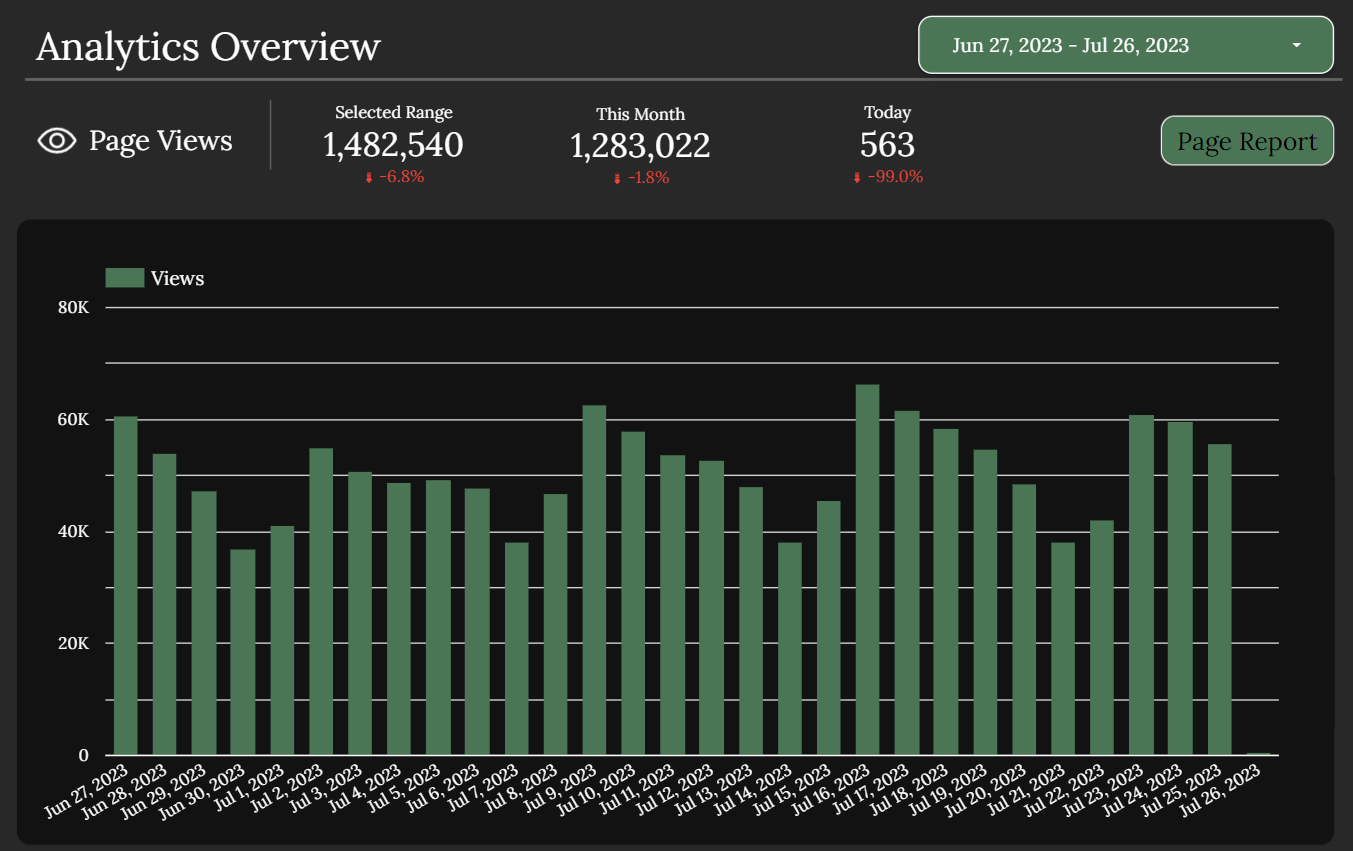
Real-time data: Business environments are dynamic, requiring swift responses. Providing real-time data on elements like foot traffic or social media engagement allows businesses to make quick, informed decisions.
Localized data: Ensure your dashboard includes data pertinent to the business's geographical area. Local search performance or region-specific sales data can give invaluable insights to a business operating on a local scale. That’s right, sometimes including information outside of their immediate business can help cement your value to the client.
User-friendly visualizations: Data should be presented in a simple, digestible format. Use intuitive charts and maps that tell a clear story of progress and performance. We’ll touch on this more later in this article, but it may surprise you just how important the proper data visualization is to help the client feel comfortable using and understanding the dashboard you provide to them.
Customization: Each local business is unique and therefore requires a customized dashboard reflecting its specific needs. Some business owners will want depth, others will want only to see a few key metrics and only want to review the data deeply in monthly or quarterly meetings with you. Providing the latter type of client with a comprehensive dashboard may actually do more harm than good.
Now that we’ve covered some of the basics, I think it’s time to expand just a little bit on some more general points. While your dashboard is important, the dashboard is not the end goal. Making it pretty can be effective for some, but at the end of the day, an aesthetically pleasing dashboard is useless if it isn’t effective. Focus on the important parts of the data first. You can always adjust the layout later.
Bonus Thought:
Communication of your dashboard and data. While this is focused largely around dashboards, dashboards are not the only way to communicate insights to your clients. One thing we’ve found that has worked well with our agency clients is to set up
automation sequences that provide their clients with key numbers every day, every week, or every month. These can go right into their inbox, be sent via text, or go into
whatever project management tool they use with their team (think Slack, Hive, Asana, etc.).
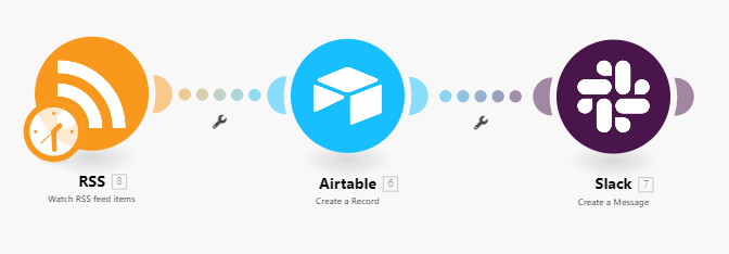
These can be set up to only send them key numbers, or you could even embed a snapshot of the dashboard to be sent to them. That way they never need to go to another spot to see their insights. While you may want them to login to a specific platform, the truth is that it’ll matter much more to your clients that you’re giving them this information in a place they already spend a lot of time.
Effective Data Visualization
With the basics in mind, one of the things that matters the most in your dashboards are your data visualizations. A bad visualization can render your dashboard, and thus the data itself, completely useless. Data visualization is not just about turning data into graphics; it's about transforming raw figures into a compelling narrative that resonates with your audience. The key to effective data visualization is simplicity and clarity.
There are dozens of different data visualizations and variations on them. For most cases, you’ll only need a handful: Line charts, bar charts (and column charts), and maybe a map. But when should each be used?
Line Charts: Line graphs are best used when you have “time series” data. That is, something like sales over time, website visitors, or anything that you’re tracking on an hourly, daily, weekly, monthly, etc. basis. These charts allow you to identify any recent trends with just a quick glance.
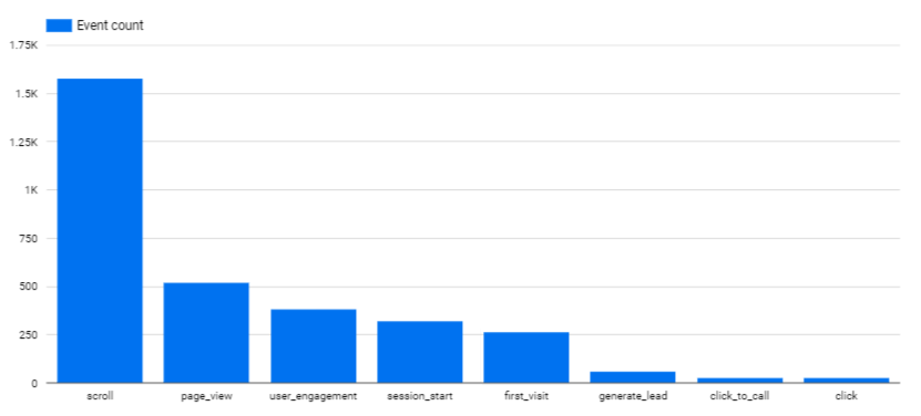
Bar Charts: Bar charts are most often used for categorical data. For example, if you wanted to see the sales of each different service the business offered, that could be presented in a bar chart, where each bar represents the total sales. Bar charts can also be used in lieu of lines in a time series visualization. Sometimes, bars can be a lot cleaner.
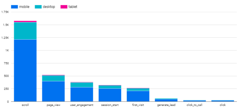
Stacked Bar Charts: These are just a slight variation on the bar charts we discussed above. Using the same example (sales of different services), we could transform that bar chart into a stacked column chart by looking at the sales associate that closed the deal. For example, let’s use a really basic example of a roofing client that does roof replacements and roof repairs. Our bar chart would just show those two. But our stacked bar chart would be very similar, but there would be multiple colors for each of our employees that went out to do the work. The figures below will help communicate this more clearly than words can.
Maps: This can be particularly useful if you have clients that services larger areas, or are looking to get an idea of where their time is being spent. You can color the map to reflect the total number of jobs in that area, total sales, average job value, average job time, or anything else. This can be particularly useful in helping your client understand areas they should or could focus more resources on. Or, if they should expand their service area or make it smaller.
While these obviously don’t cover every type of visualization, these are certainly the most useful as you get started. One quick note here, you’re probably wondering “but what about pie charts.” Pie charts are horrible at communicating insights. Avoid them at all costs. Bar charts are just as easy to make and significantly easier to understand and see differences in. Do yourself and your clients a favor - avoid pie charts.
The Backbone of the Dashboard: Data Storage and ETL Tools
Behind every effective dashboard is a robust data storage system and efficient Extract, Transform, Load (ETL) tools. This may seem like something that you won’t need to worry about. I would encourage you to consider the counterpoint. Data storage is about ensuring that your data is secure, accessible, and ready for analysis at all times. By setting up a database, or even just using ETL tools that help you better control your data, you’ll be primed to answer questions that live below the surface.
While you may not be sure what a database even really is, much less how to create and manage one, don’t worry. Where you choose to go with us for your data management needs, someone else, or just try your hand at it yourself, it’s an important step to becoming a truly data-driven digital marketing agency. But the precursor to that is understanding how to properly organize your database, even if it’s just a spreadsheet, so that your data is as usable as possible.
That’s all we’ll say on the database setup side for now. Just realize you don’t need it to get started, so don’t let it hold you back. But, as you continue to build up your data muscles, a database will be one of the first places you’ll want to turn. For each individual client, and for all of them. The database will open up additional questions you’d be unable to even consider asking if you just stored all of your data in Excel spreadsheets.
Wrapping it Up
Creating powerful client dashboards can seem like a daunting task. It’s really only scary on the surface, and likely more scary because you don’t have the confidence that you can make the dashboard as pretty as it needs to be. Based on our experience of working with over 100 clients, only a handful of them have ever even cared about how it looked. And even those only came after they were able to see all of the data and insights they were hoping for.
Focus your efforts where it matters, improving the communication of your value to your clients. It will not only help retention, but it may even help you figure out how you can continue to improve your skills in serving your clients.
Dashboards have the power to tell a compelling story of progress and actionable data. As a marketing agency, your role is to help local businesses understand their narratives and use them to build stronger futures. In mastering this, you'll have a clear competitive edge, providing an unparalleled level of service to your clients.